


 MENU
MENU

精選案例

TRANZAC

| Service | LOGO Design |
| Year | 2021 |
Context
TRANZAC 為專注於汽車零件進出口貿易與國內外經銷的企業,業務橫跨多個市場與供應鏈環節。在全球化貿易與高度競爭的產業環境中,品牌需要建立更具國際感與信任度的識別系統,以強化其專業定位。
Approach
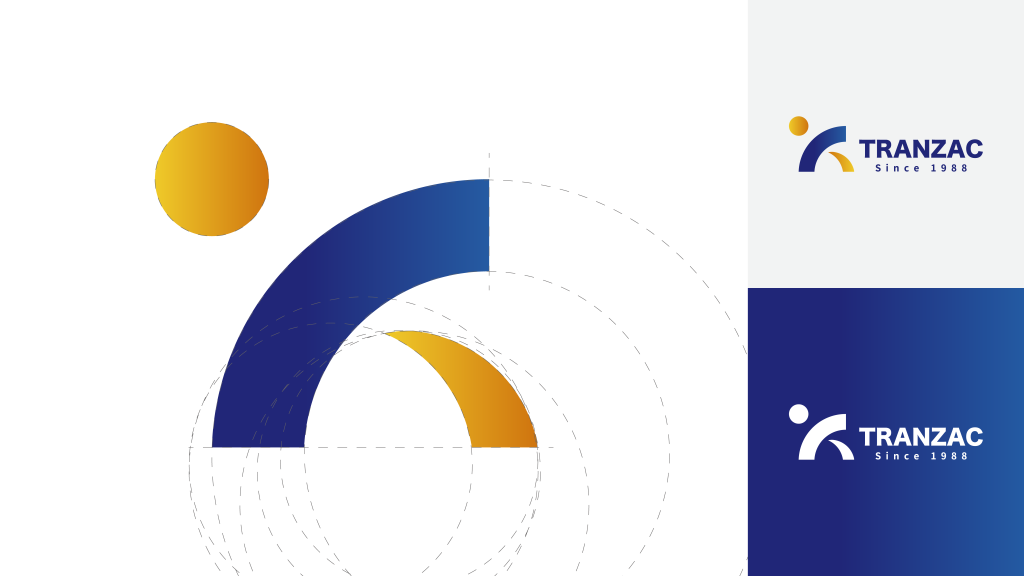
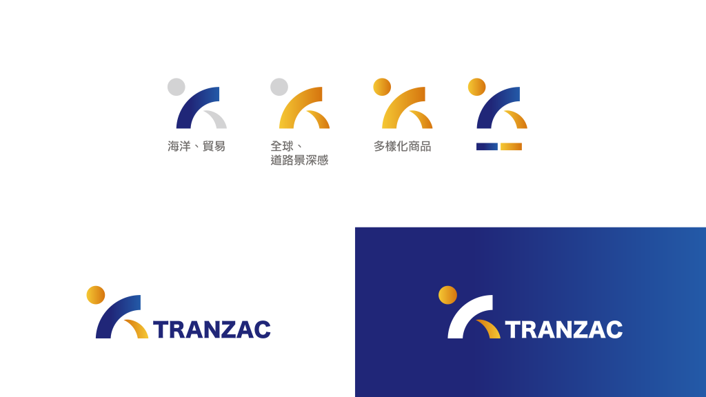
設計以「全球流通與多元產品結構」為核心概念,從進出口貿易的產業特性出發,建立具延展性的視覺語言系統。
透過象徵全球連結與流動性的設計語彙,結合穩定且具結構感的幾何形式,強化品牌在跨市場溝通中的一致性與辨識度,使視覺識別能清晰傳達其國際貿易角色。
Outcome
最終建立一套具國際語境與專業感的品牌識別系統,使 TRANZAC 能在多市場、多產品線的業務結構中維持清晰一致的品牌形象,並強化其全球貿易網絡中的信任與辨識度。
Context
TRANZAC is a company specializing in automotive parts import/export and distribution across domestic and international markets. Operating within a complex global supply chain, the brand required a visual identity that communicates trust, professionalism, and international reach.
Approach
The design is based on the
concepts of global circulation and product diversity, reflecting the structural nature of
import-export trade. A scalable visual language was developed to express connectivity and movement
across markets.
By combining symbolic references to global networks with structured geometric forms, the identity
system reinforces clarity and consistency across different commercial environments.
Outcome
The resulting identity system establishes a clear and internationally oriented brand presence for TRANZAC, enabling consistency across multi-market operations while strengthening recognition and trust within the global trade network.

 發信給店家
發信給店家 聯絡店家
聯絡店家 加入店家line好友