


 MENU
MENU

精選案例

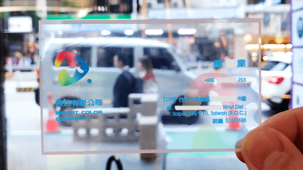
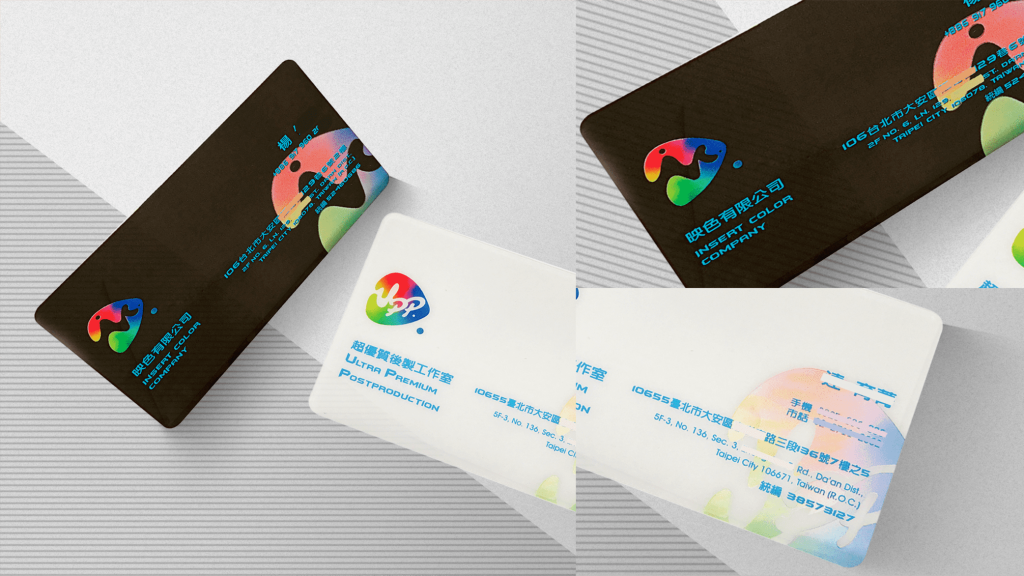
映色有限公司

| Service | LOGO Design |
| Year | 2019 |
Context
映色有限公司為專注於影像調光與視覺色彩處理的專業服務公司。 在影像產業逐漸數位化與標準化的趨勢下, 品牌需要一套更具識別性與專業感的視覺系統, 以強化其技術導向的市場定位。
Approach
設計以「影像控制與色彩轉換」為核心概念, 從品牌名稱與產業特性出發, 整合三個關鍵視覺元素:
- 播放鍵(Play Icon)
- 英文名稱結構(Wordmark)
- 調光光譜(Color Spectrum)
透過幾何重組與符號整合, 將原本分散的視覺語意轉化為單一識別標誌, 使品牌同時具備功能性隱喻與結構一致性, 建立清晰且易於辨識的品牌語言。
Outcome
最終建立一套結合功能象徵與品牌識別的視覺系統, 使映色有限公司於影像調光領域建立更清晰的品牌定位, 並提升市場辨識度與專業信任感。
Context
Color Company is a professional imaging color grading and visual adjustment company. As the imaging industry becomes increasingly digitalized and standardized, the brand required a more distinctive and professional visual identity system to strengthen its technical positioning.
Approach
The design is centered on image control and color transformation, integrating the play icon, the structure of the brand name, and the concept of the color spectrum into one cohesive identity system.
Outcome
The resulting identity system establishes a clear and function-driven brand expression for Color Company, enhancing recognition, professionalism, and trust within the imaging and color grading industry.



 發信給店家
發信給店家 聯絡店家
聯絡店家 加入店家line好友