


 MENU
MENU

精選案例

JH REFRACTORIES
| Service | LOGO Design |
| Year | 2020 |
Context
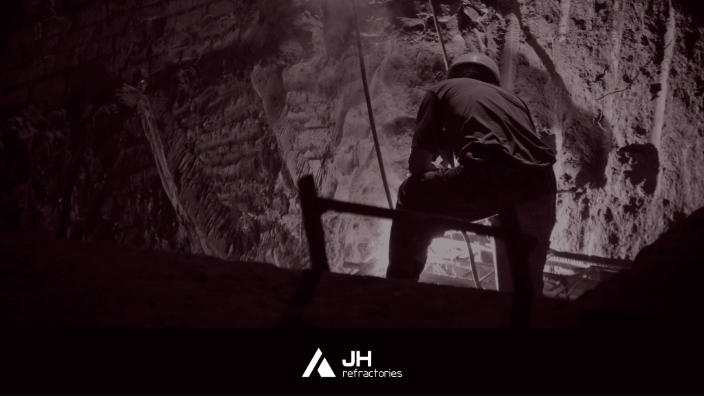
JH REFRACTORIES 為專注於耐火材料的專業企業,主要服務鋼鐵產業,業務涵蓋煉鋼爐耐火層施作、原料供應與技術研發。在高度專業與安全要求極高的工業環境中,品牌需要建立更具信任感與結構性的識別系統,以傳達其技術能力與產業地位。
Approach
設計以「穩定性、結構性與產業領導性」為核心概念,從耐火材料的功能特性出發,轉化為具象徵意義的幾何語言。
標誌以三角形作為主要視覺結構,象徵穩定、強度與支撐,同時隱喻企業在產業鏈中的核心地位與領導角色。透過簡潔且具重量感的造型語彙,強化品牌在工業領域中的專業性與可信度。
Outcome
最終建立一套具備高度穩定性與識別性的品牌標誌,使 JH REFRACTORIES 能在鋼鐵與耐火材料產業中清晰傳達其技術專業與產業定位,並強化其作為關鍵供應鏈夥伴的市場信任感。
Context
JH REFRACTORIES is a specialist in refractory materials, primarily serving the steel industry. Its operations include refractory lining for steel furnaces, raw material supply, and technical R&D. Within a highly demanding industrial environment where safety and performance are critical, the brand required a structured and trustworthy identity system to reflect its technical expertise and industry position.
Approach
The design is grounded in the
principles of stability, structure, and industrial leadership, translating the functional nature of
refractory materials into a symbolic geometric language.
A triangle is used as the core visual element, representing stability, strength, and support, while also
symbolizing the company’s leadership role within the industry. The minimal and weight-driven form
language reinforces the brand’s professional and industrial character.
Outcome
The resulting identity system establishes a strong and stable visual foundation for JH REFRACTORIES, enabling clear communication of its technical capability and industrial positioning, while strengthening trust within the steel and refractory materials supply chain.



 發信給店家
發信給店家 聯絡店家
聯絡店家 加入店家line好友