


 MENU
MENU

精選案例

O. Real
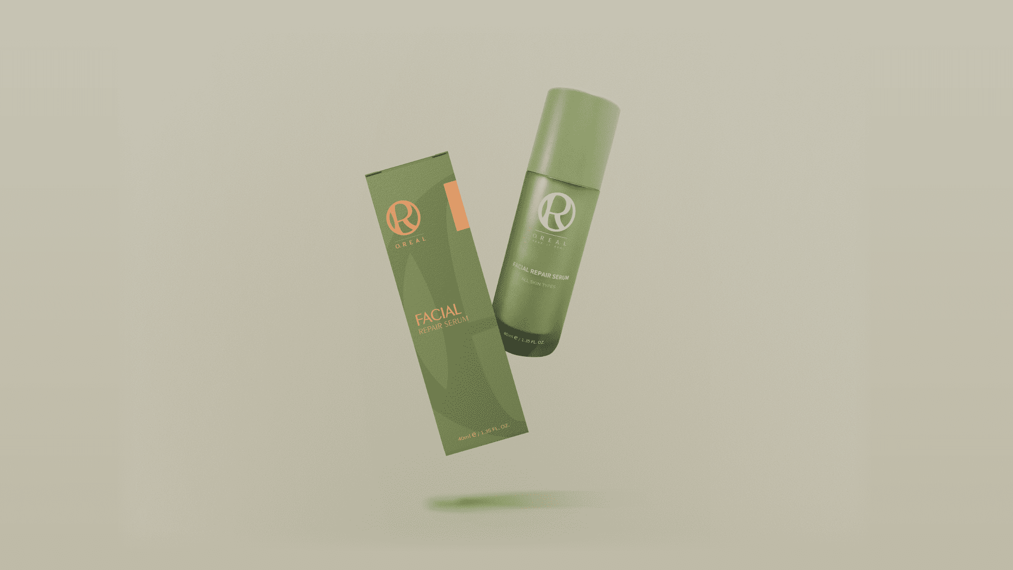
| Service | LOGO, Packaging Design |
| Year | 2020 |
Context
O. Real 為一兼具品牌與包裝設計需求的專案,品牌定位於日常使用情境中的活力與正向感受,期望透過識別系統建立更具辨識度與情感連結的品牌形象。
Approach
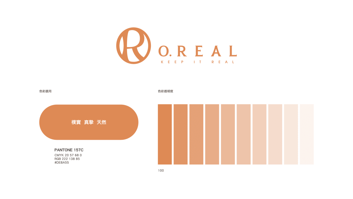
設計以極簡且具結構感的視覺語言為基礎,將品牌名稱轉化為核心識別元素,並透過流動的曲線與幾何結構之間的平衡,建立具彈性與延展性的標誌系統。
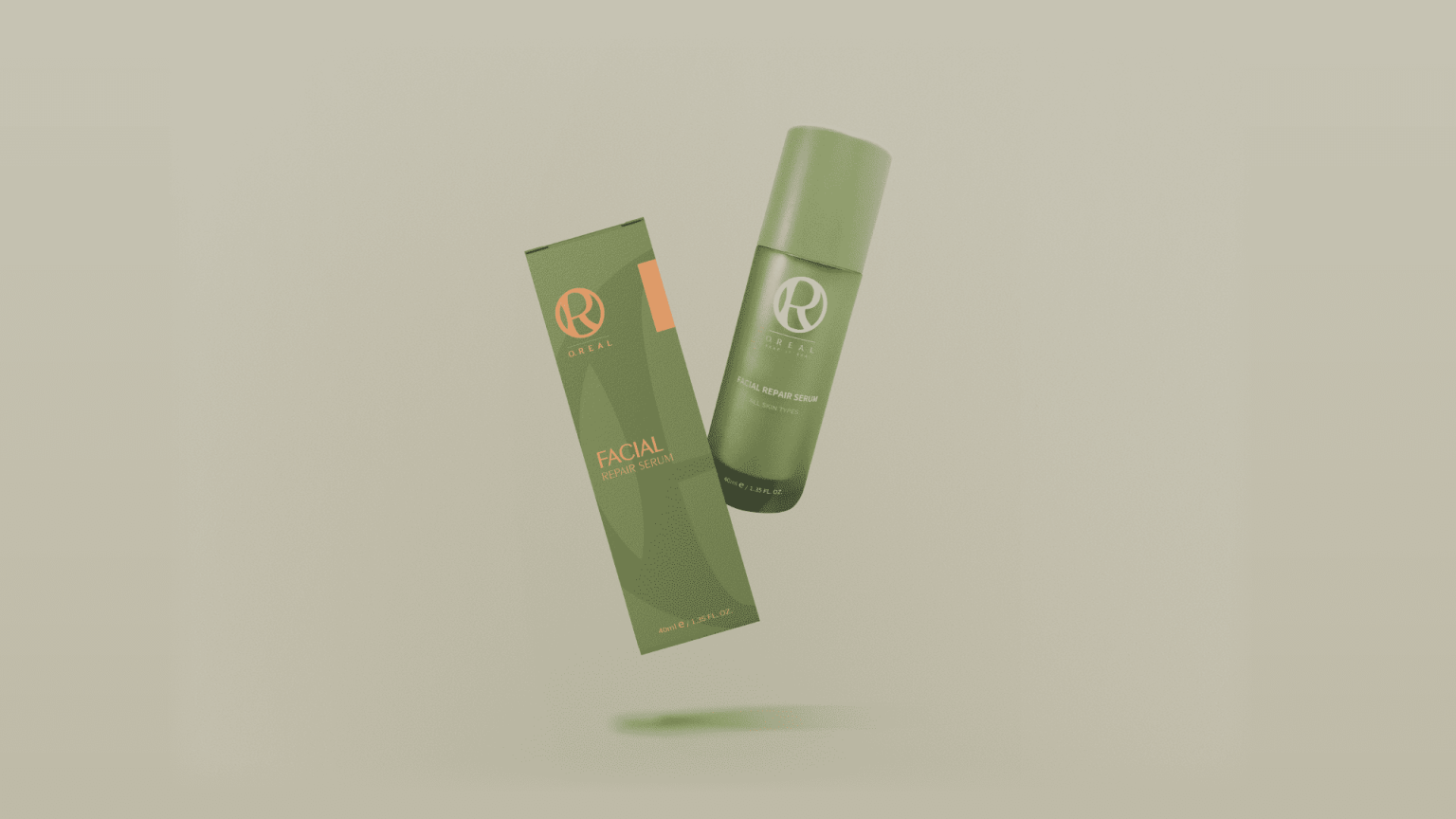
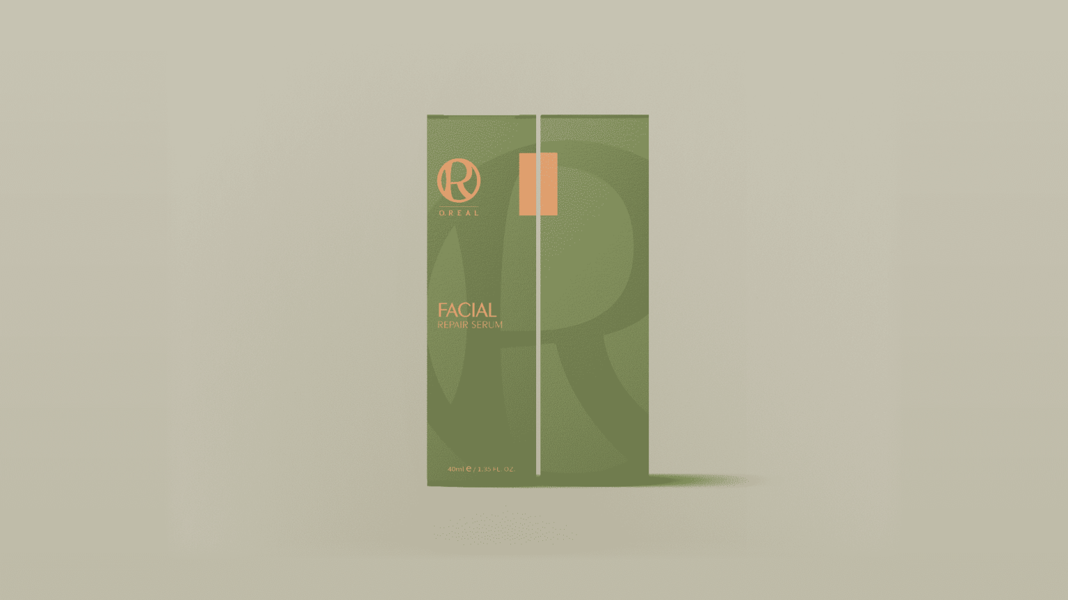
整體設計強調簡化與整合,使視覺符號在不同應用場景中仍能維持一致性與清晰度,並兼顧品牌在包裝上的延伸需求。
Outcome
最終建立一套兼具識別性與情感連結的品牌視覺系統,使 O. Real 能在日常消費場景中傳遞更具活力與一致性的品牌印象,並強化使用者對品牌的整體記憶與認同感。
Context
O. Real is a branding and packaging project designed to express vitality and positive everyday experiences. The brand aims to build a more recognizable and emotionally engaging identity within daily-use product contexts.
Approach
The design is based on a
minimal and structured visual language, transforming the brand name into a core identity element. A
balance between fluid curves and geometric structure was explored to a flexible and scalable visual
system.
The system emphasizes simplification and integration, ensuring consistency and clarity across
various applications, including packaging design.
Outcome
The resulting identity system establishes a cohesive and emotionally resonant brand presence for O. Real, enhancing recognition in everyday consumer environments while strengthening overall brand recall andconnection.

 發信給店家
發信給店家 聯絡店家
聯絡店家 加入店家line好友