✦ Capturing Moments · Chronics of Time-Driven Stories ✦
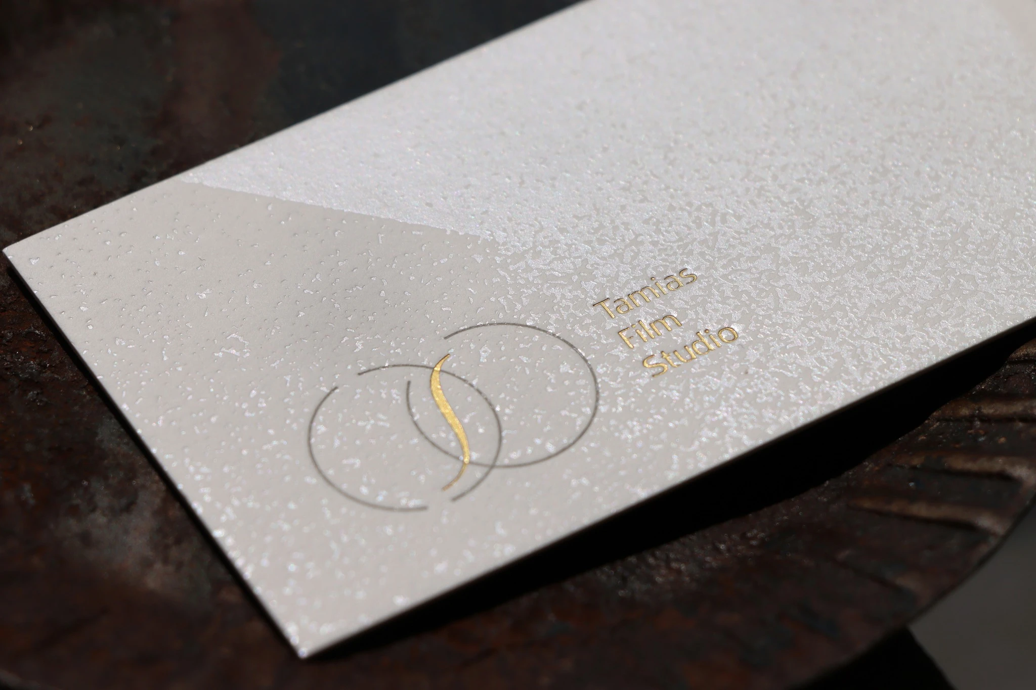
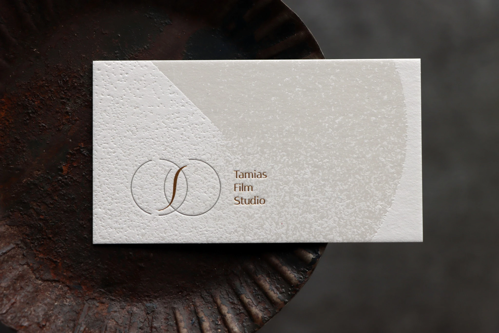
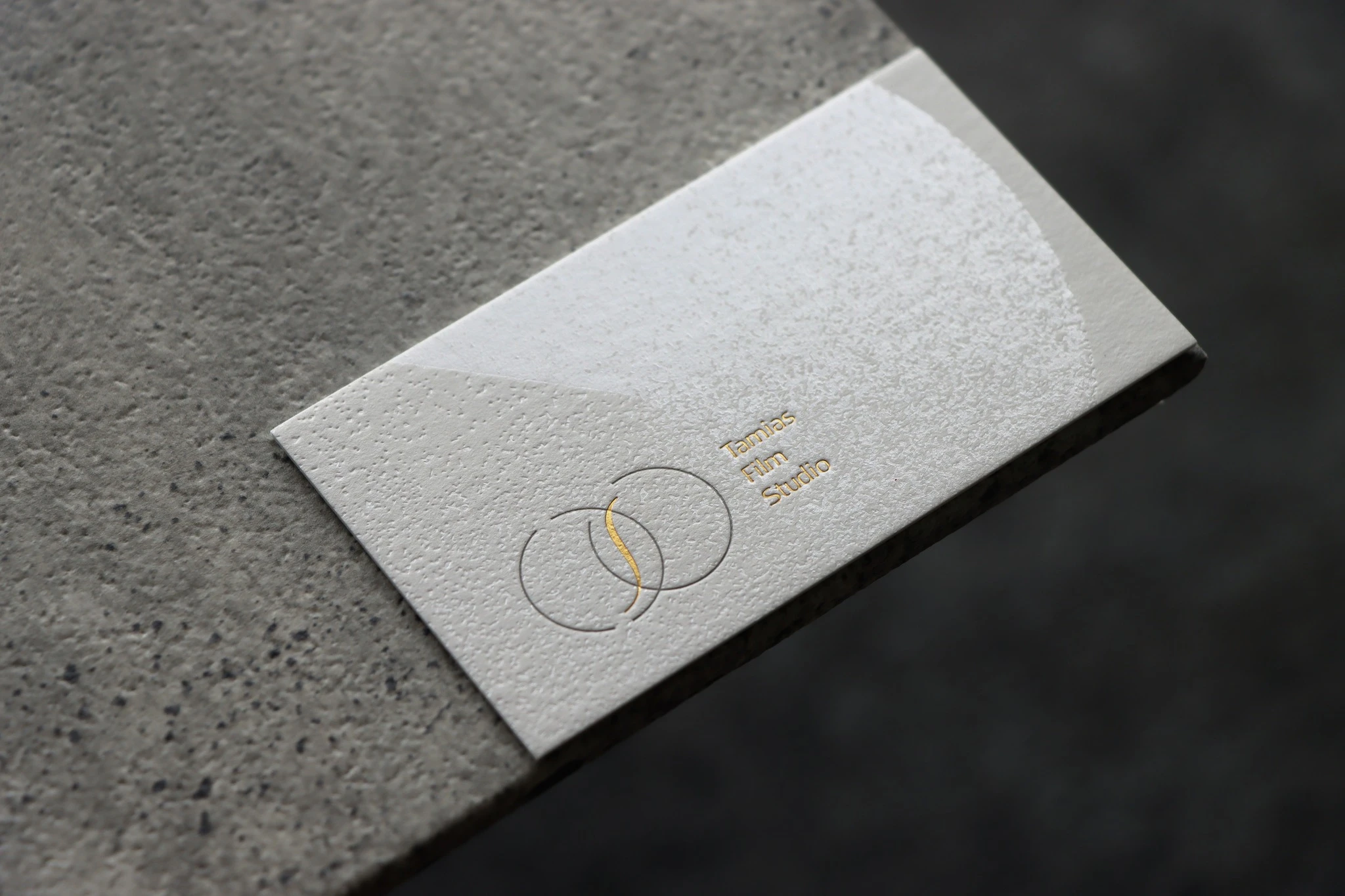
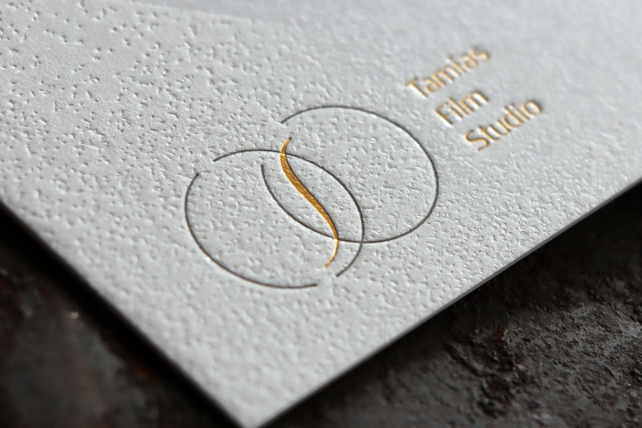
The core visual of the logo features two interlocking circles, a concept inspired by the wedding rings that gave the brand its name. At the same time, these circles represent a camera lens. By intentionally fading certain lines, the design mirrors the subtle shifts of light in photography, creating a dynamic composition rich in depth and contrast.
At the intersection of the two circles, an elegant curve is introduced—a subtle nod to the brand's mascot, the chipmunk's tail. This thoughtful touch seamlessly weaves the brand’s identity into the heart of the logo.
✦ Intertwining Light and Shadow · Preserving the Nuances of Time ✦
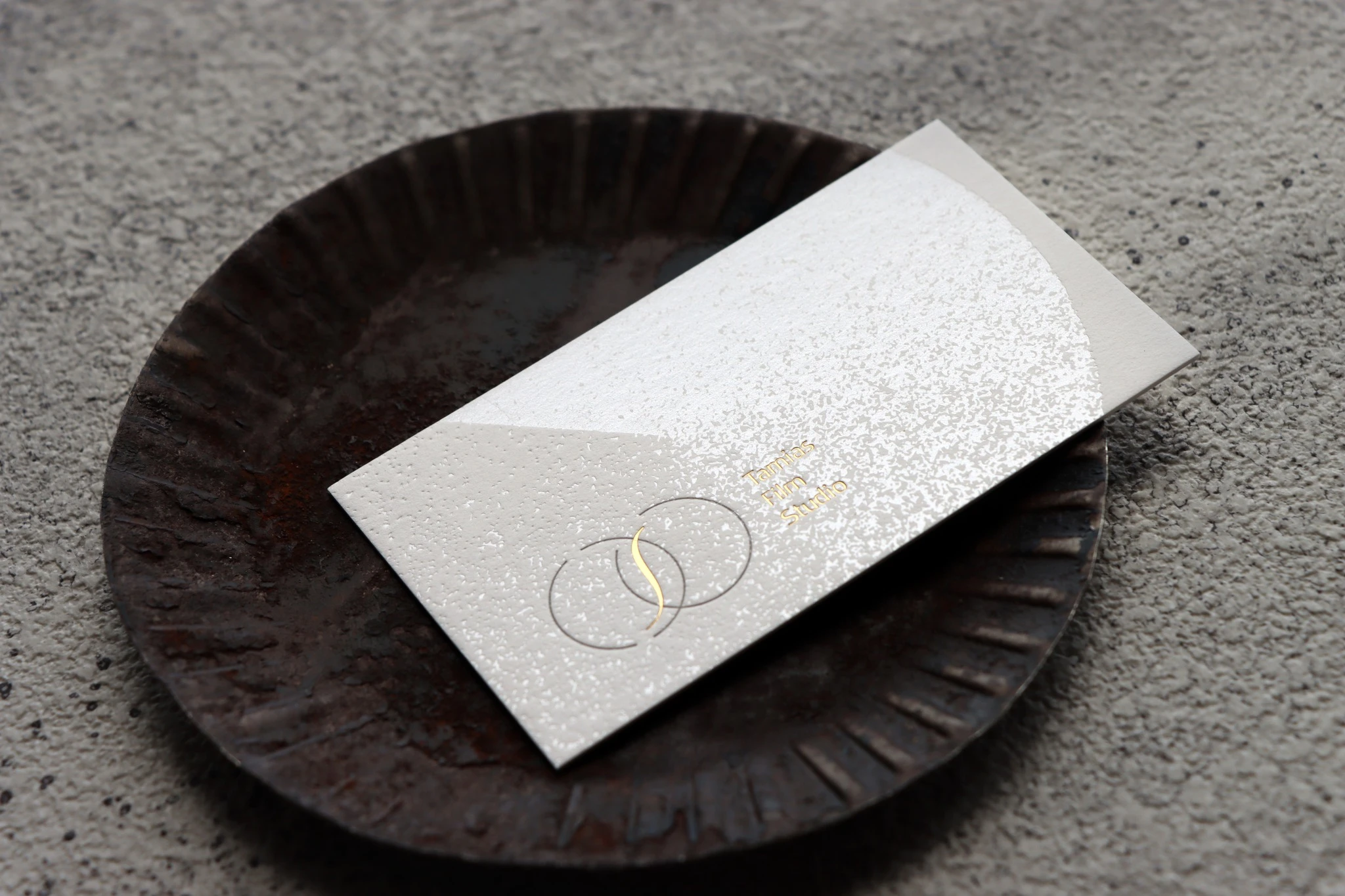
For the business card design and printing, clear foil stamping was employed to capture the essence of gradual transitions. As light catches the clear foil, it creates a subtle, shifting refraction, lending the surface an exquisite sense of depth and tactile detail.
Watching the play of light and shadow feels as though time itself is flowing across the paper—much like how photography freezes a moment, preserving touching stories for a lifetime.
Every detail of the business card aligns beautifully with the brand’s philosophy, showcasing both design sophistication and professional dedication, making the card a true medium for sharing beauty and trust.


 MENU
MENU


 發信給店家
發信給店家 加入店家line好友