

 MENU
MENU
PORTFOLIO

堆設計
BRAND
STACK DESIGNCONCEPT
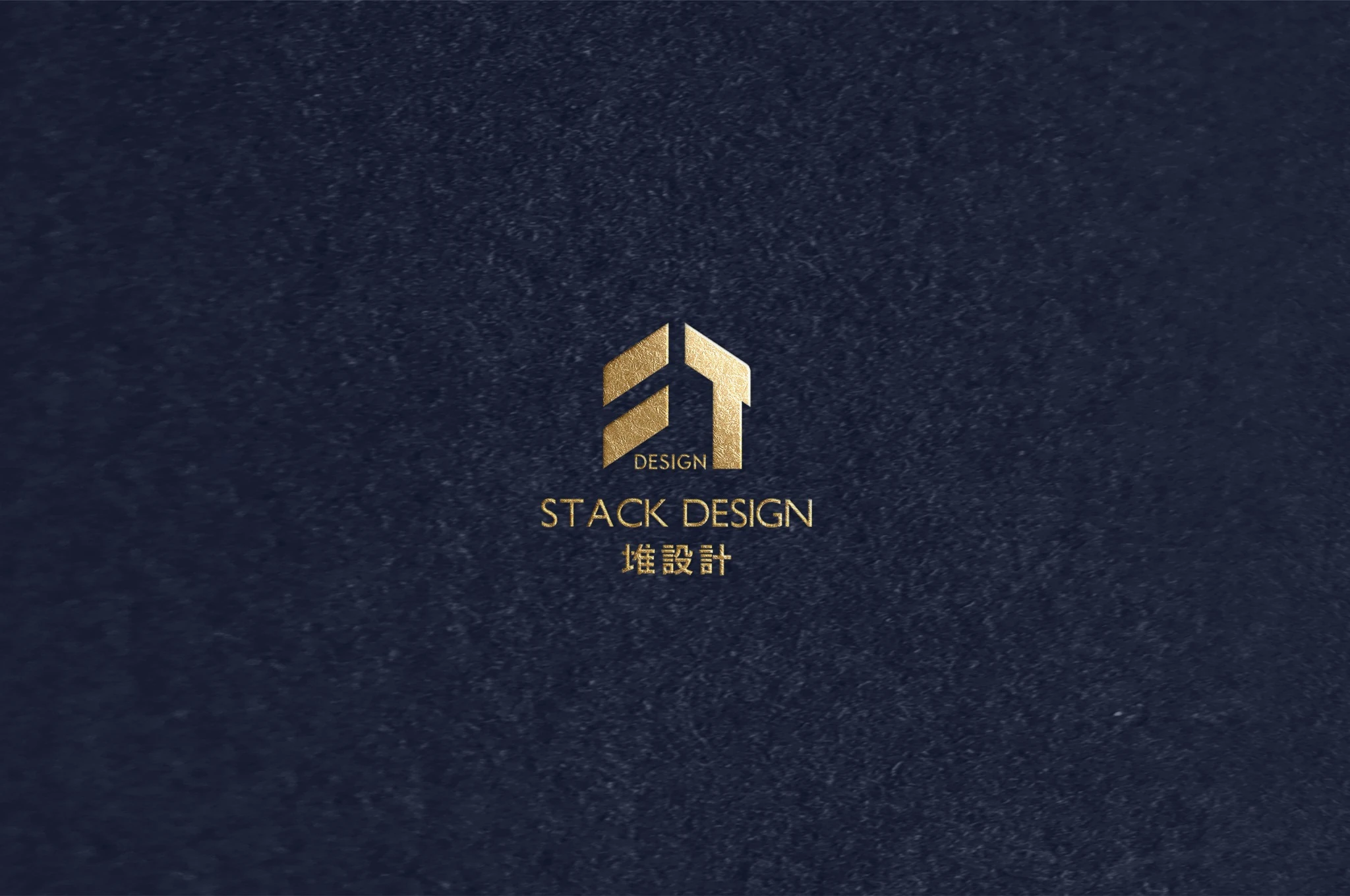
✦ Geometric Deconstruction: Shaping a Life with Warmth ✦
The essence of design lies in condensing complex ideas into absolute symbols. Driven by minimalism, STACK DESIGN deconstructs the letters "S" and "T" from its brand identity. The "S" symbolizes the rhythm of stacking, capturing the structural beauty of gradual progression. The "T" transforms into a bold, vertical brushstroke, serving as the core axis that supports all creative endeavors.
Departing from intricate, literal representations, we translate the organic vitality of "green trees" and the artisan spirit of the "paintbrush" into a refined linear language. The resulting emblem evokes the organic form of nature while simultaneously sketching the stable, welcoming silhouette of a "home."
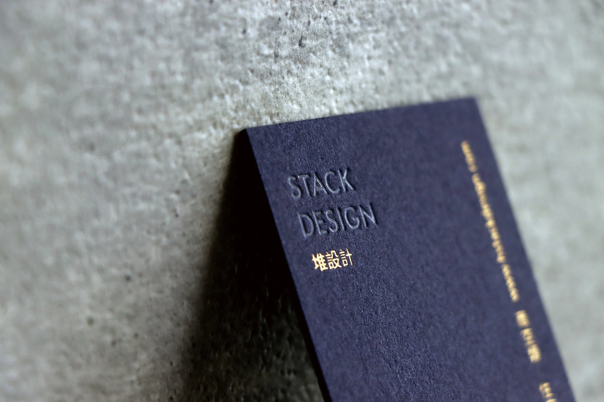
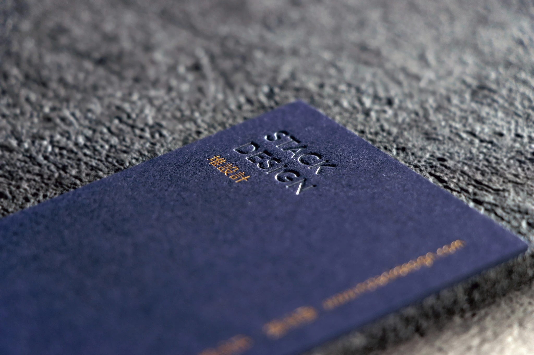
✦ Artisan Craftsmanship: A Medium of Trust and Design ✦
From brushstrokes to architecture, from nature to structure—shapes are our language. Within a static canvas, they manifest a powerful dedication to stacking designs and building lives.
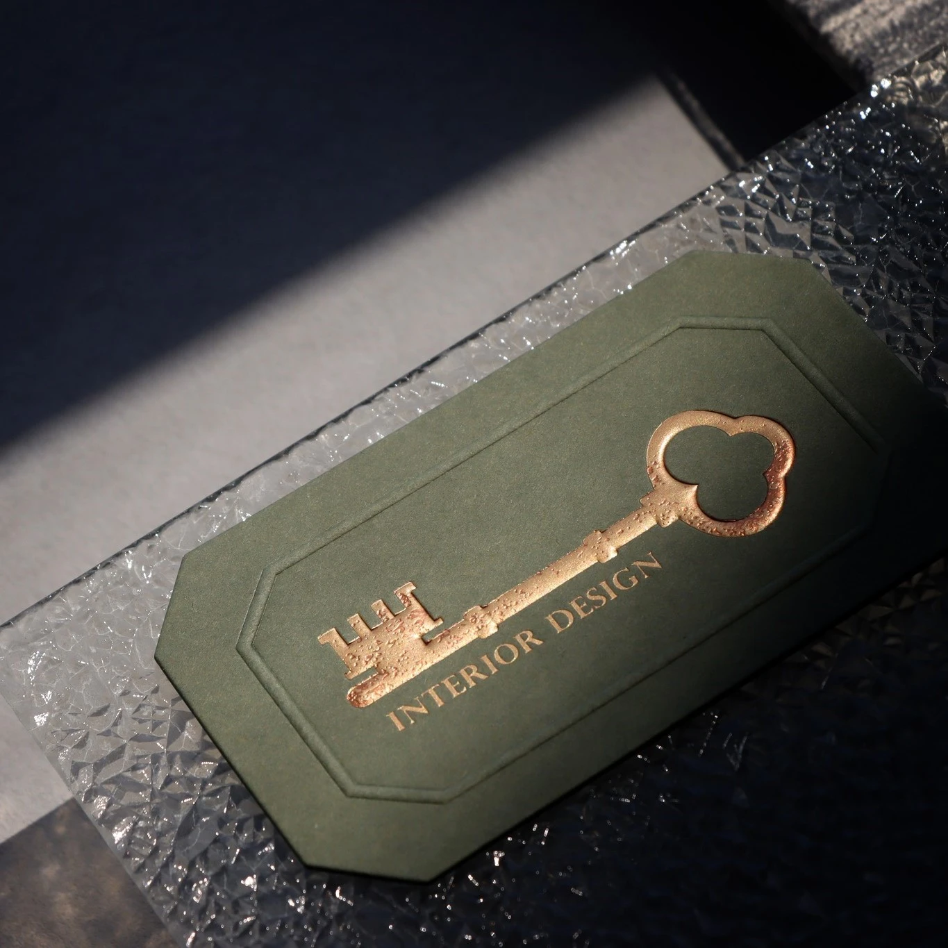
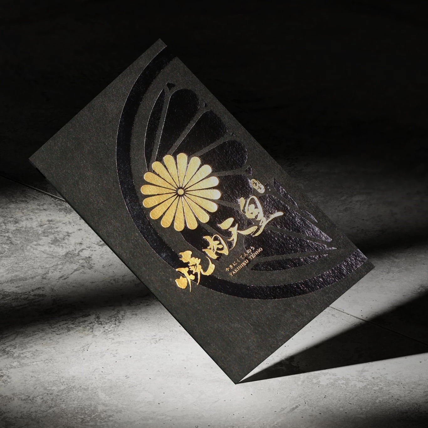
Our business card design seamlessly aligns with this brand philosophy. It fully expresses the tactile quality of our work and our dedicated professionalism, turning a simple business card into a meaningful medium that conveys beauty and fosters trust.
相關文章
 發信給店家
發信給店家 聯絡店家
聯絡店家 加入店家line好友